
Showpad
Showpad is a mobile-first company that helps sales representatives in the field present and manage their sales content. When I was employed at Showpad as one of three product designers, the company's primary purpose was enabling salespeople to find, share, and present content from an always-up-to-date repository managed by their respective marketing teams (they have since completed major acquisitions and shifted their overall strategy).
Contents
Free trial analysis and a smoother sign-up flow (coming soon)
Interaction and animation on Showpad Channels (coming soon)

Screens from the file picker, highlighting a multi-page document and the two potential approaches to page selection: thumbnails or detail views
File / page selection for Shares and Collections
Through customer calls and conversations with our own salespeople using Showpad, I knew that marketers were expected to have content available to cover as many situations as possible, but salespeople wanted their prospects to see presentations that were as tailored as possible.
This is why Collections, custom presentations that salespeople could create by mixing and matching documents approved by their marketing staff, were integral to the Showpad pitch experience.
As an improvement to the Collections experience, users wanted to be able to pick out specific pages from PDFs or documents that were pertinent to various prospects without including the unrelated or filler pages in their presentations.
My scope for this project was strictly the low-fidelity flows of both web and iOS - I designed and tested in low to mid-fidelity (shown on this project), then handed this project off for the ultimate visual design.

Some differences from the earlier mockups I user tested of the file picker included a list that lacked clear selection indicators or search functionality, and an overcrowded utility bar in the page picking window.
Reflecting the mobile-first mantra
A key tenet of the web file picker was that it needed to directly reflect the mobile interface. Like almost all other projects at Showpad, the file picker project actually originated on iOS, and was expanded into a web interface.

Rough iOS explorations of page picking concepts from our three-person simultaneous design sprint challenges (I really don't like those green preview buttons)
Documents act as folders in this context
I was able to quickly validate this assumption with a few paper prototypes I ran by some salespeople, and that helped drive this project forward quickly. Since we were now framing pages as the basic unit of what we could share or present, documents were just assortments of "pages" (or just one page alone).
The only differentiator for documents and folders was that I needed to articulate that a document could be partially selected, whereas folders couldn't be selected. In retrospect, perhaps folders didn't need to be treated distinctly anyways, but could just have been flattened and presented in their default order when bulk selected.
At the time, however, that was not an engineering question the development team felt was addressable in the first place, so folders were kept separate and un-selectable and I did not give that any further thought.
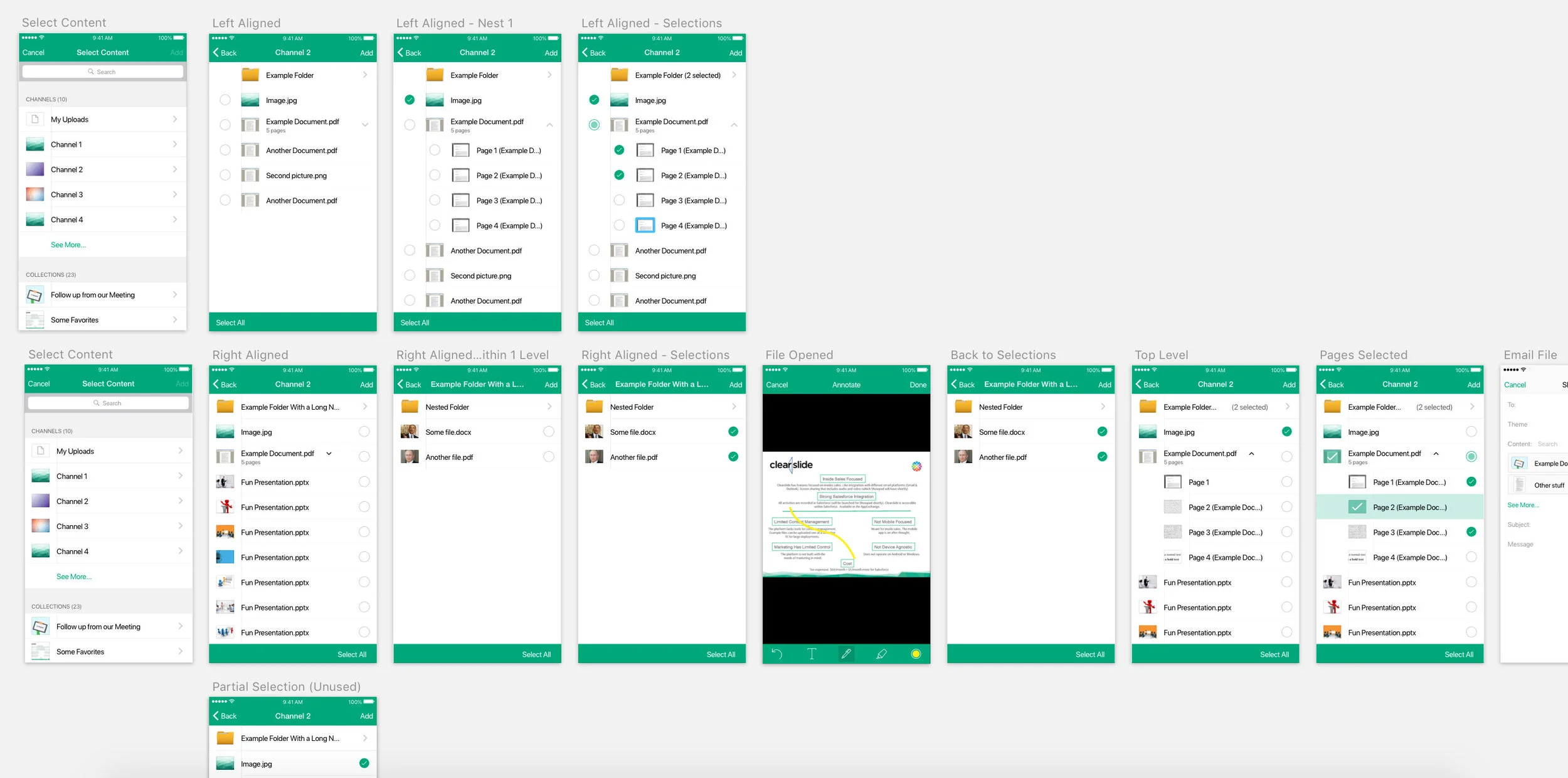
Comparing concepts of visible nesting on iOS for page picking. One of the difficulties was expressing that documents were essentially treated like directories since users could insert an entire document or just a subset of pages for a presentation.
Free Trial analysis and a smoother sign-up flow
Coming Soon
Interaction and animation on Showpad Channels
Coming Soon